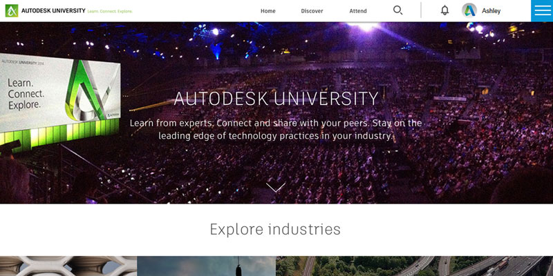

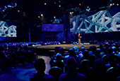
Autodesk University
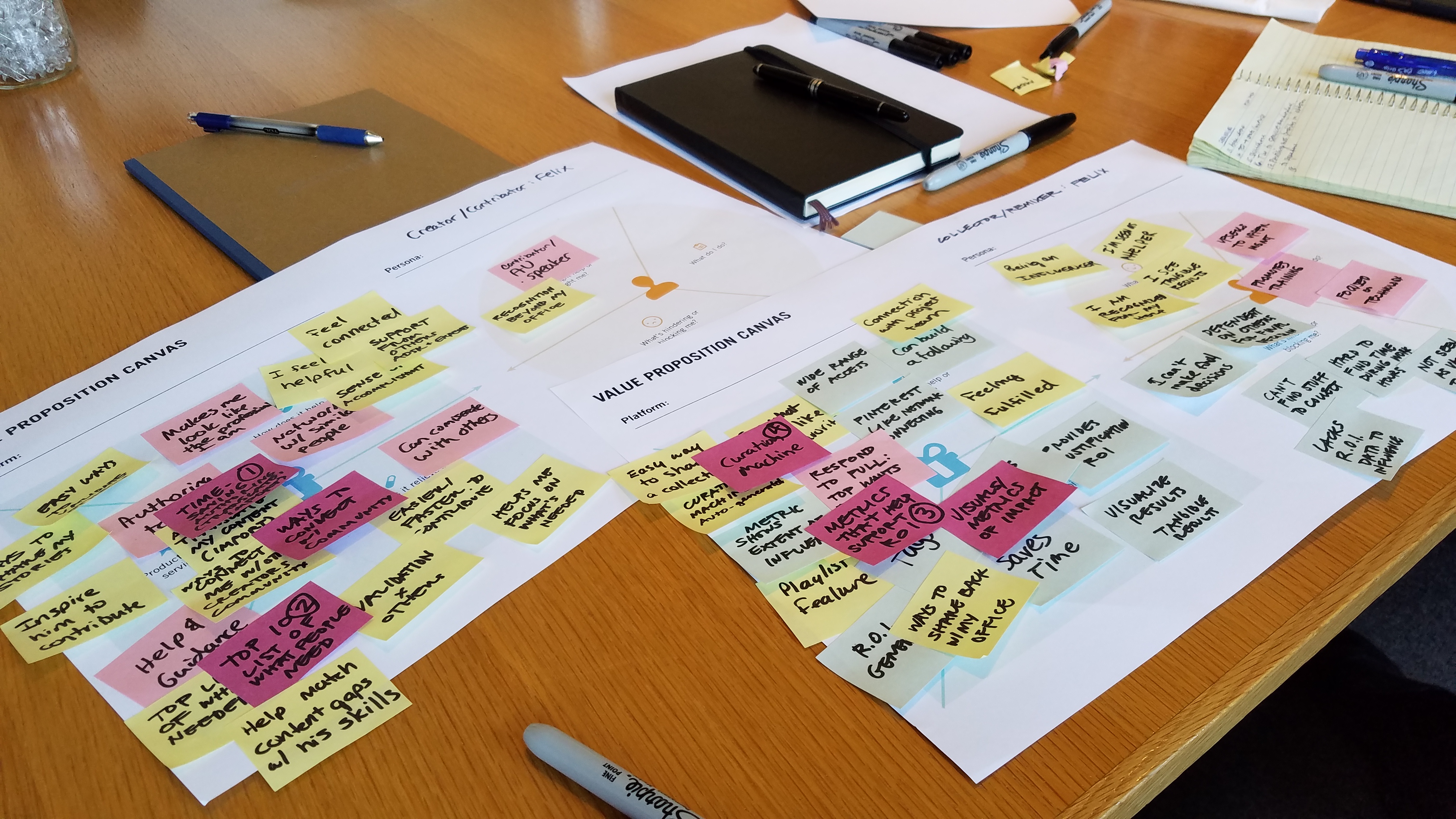
In preparation for the Autodesk University conference in November of 2016, Autodesk came to Sequence looking to solve problems with their online presence and the clarity of brand and value being presented to users. I participated in a 3-week exploration phase as well as 3 sprints that were 2 weeks in length. These designs and learnings then go into a final prototype that will be presented at the Autodesk University conference in Las Vegas for final user testing.
Team Composition: 1 Creative Director, 1 Art Director, 1 UX Designer, 1 Project Manager, 1 Account Director
Agency:
Sequence
Project Type:
Company Direction and Website Redesign
Role:
Senior UX Designer
Problems for Autodesk University
- Content on AU is difficult to search and deliver
- Content on AU feels like a giant space with no one else around (like an empty library)
- Lack of identity to differentiate AU from other brands within the Autodesk ecosystem such as AKN (Autodesk Knowledge Network)
- Lack of vision around what AU can offer those who do not attend the AU conference in Las Vegas


Problems for Autodesk Users
- Experts within the Autodesk community are looking to solve complex work problems that go beyond how to use software
- Managers within firms responsible for keeping up with market shifts, best practices and software upgrades need access to the latest and best information to do their job well
Problems for Autodesk
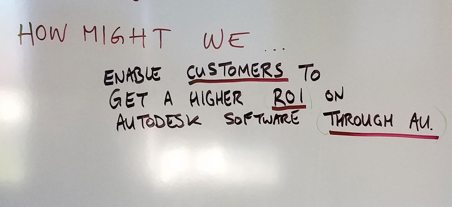
- Autodesk needs to prove software subscription value and ROI in focusing on redesigning AU
- Autodesk wants to be seen as a place of career advancement when they are currently not trusted in that area

Mission Statement
To enable communities of expert practitioners to connect, learn, and share so that they accelerate the advancement of technology practices in their firms and industries.
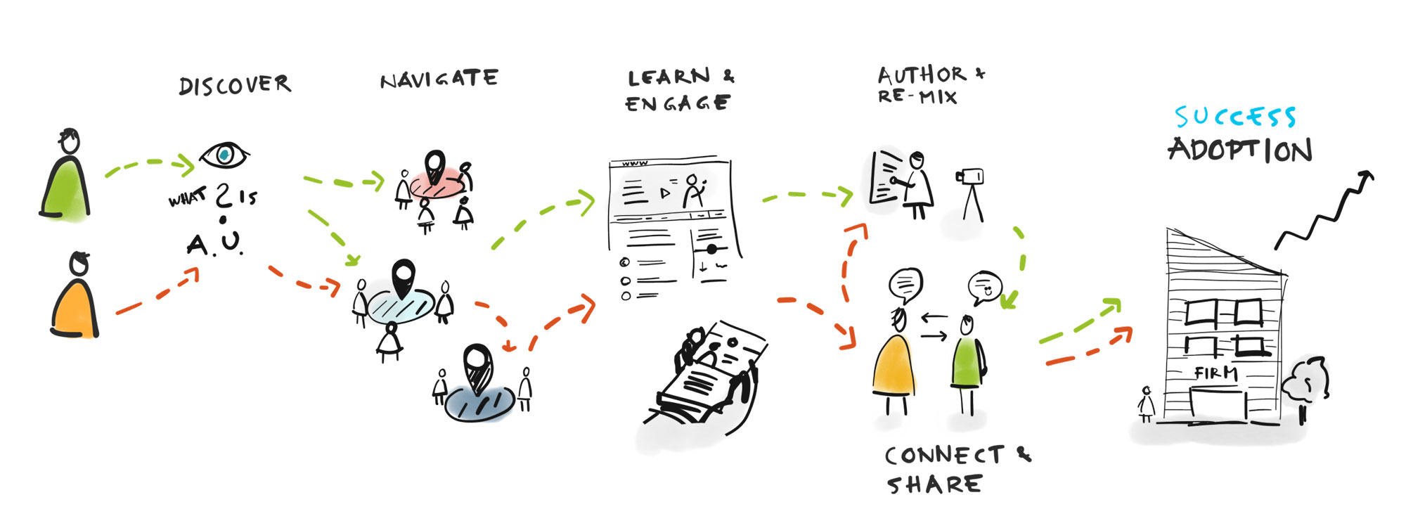
Goal
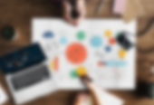
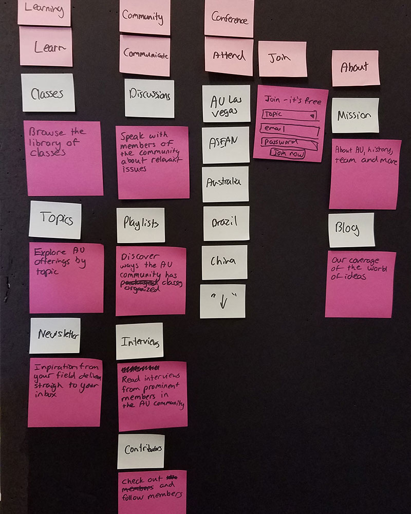
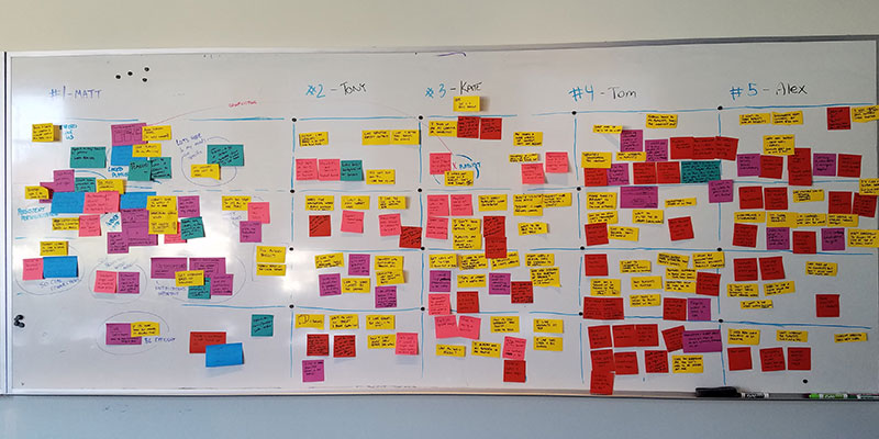
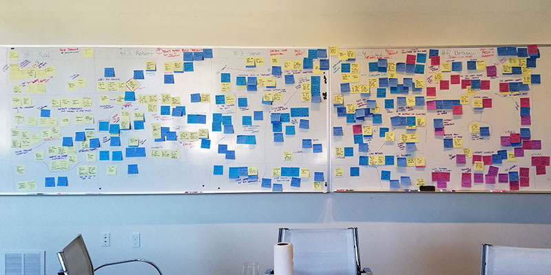
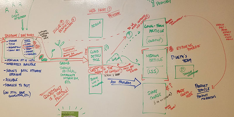
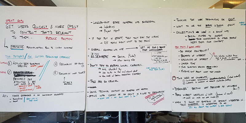
During our collective team exercises, a map of key obstacles/challenges emerged. This white-board drawing captures the main elements of the user experience that needed to be designed in order to move users from individual learners to an engaged community.

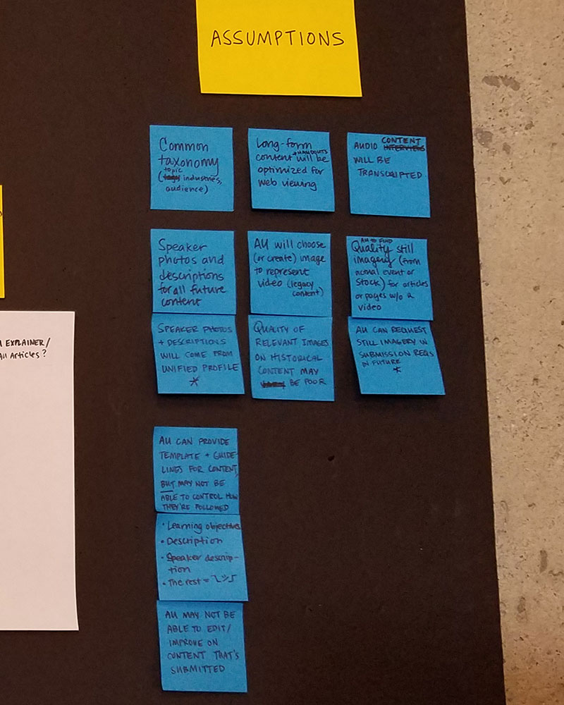
Assumptions Based on Stakeholder Interviews
In the exploration phase, we read through research materials and interviewed key stakeholders who had worked closely with users for a number of years. From this information, we formed our goal and mission statement as well as the assumptions moving forward.
- An AU Online Platform is of value to Autodesk customers
- Industry and firms are ready to be more open in sharing and discussing their technology practices
- Speakers are respected as SMEs in the community, and the content produced will fuel community discussions
- Online community participation (exchange) will lead to stronger professional relationships that ultimately will lead to ‘Customer ROI’


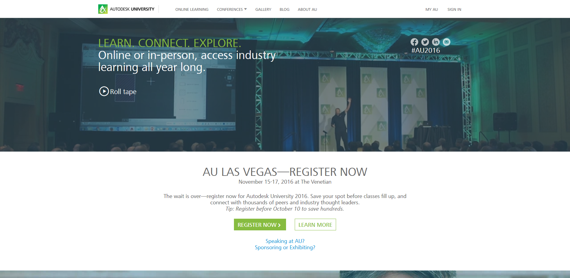
Sprint 1: Homepage
Homepage Initial Exploration
"We believe that through a clear homepage experience that we can create a sense of place and community for expert users & tech managers. We will know this to be true when users express excitement and interest in using the new AU online experience."
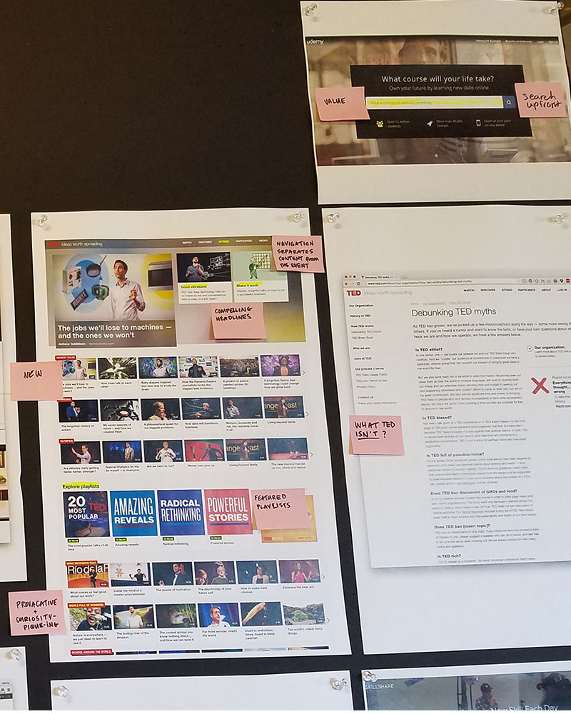
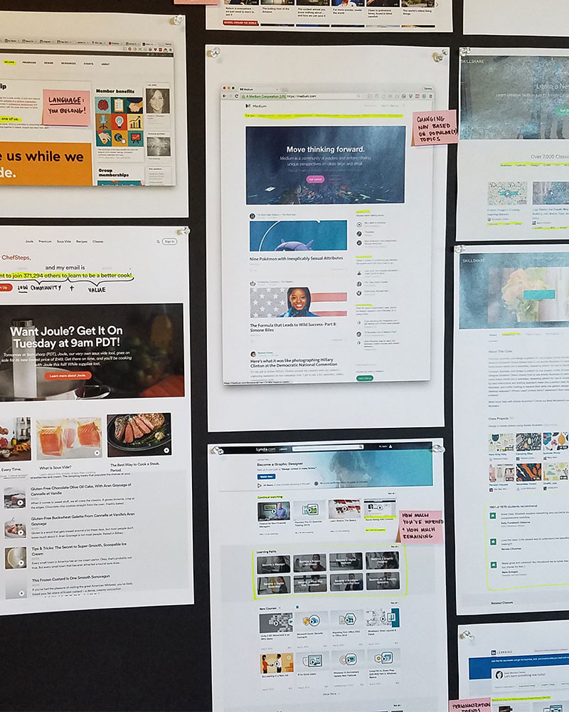
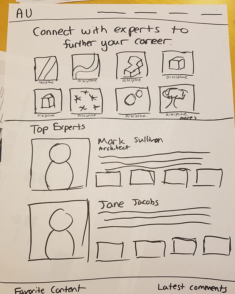
Kicking off Sprint 1, we focused on exploring other homepage experiences and the components that would make up the homepage. We wanted to communicate that this was a place for expert users and make them excited for what AU had to offer. In the background, we were also trying to convey that this was an online community and not just a library of post conference content.


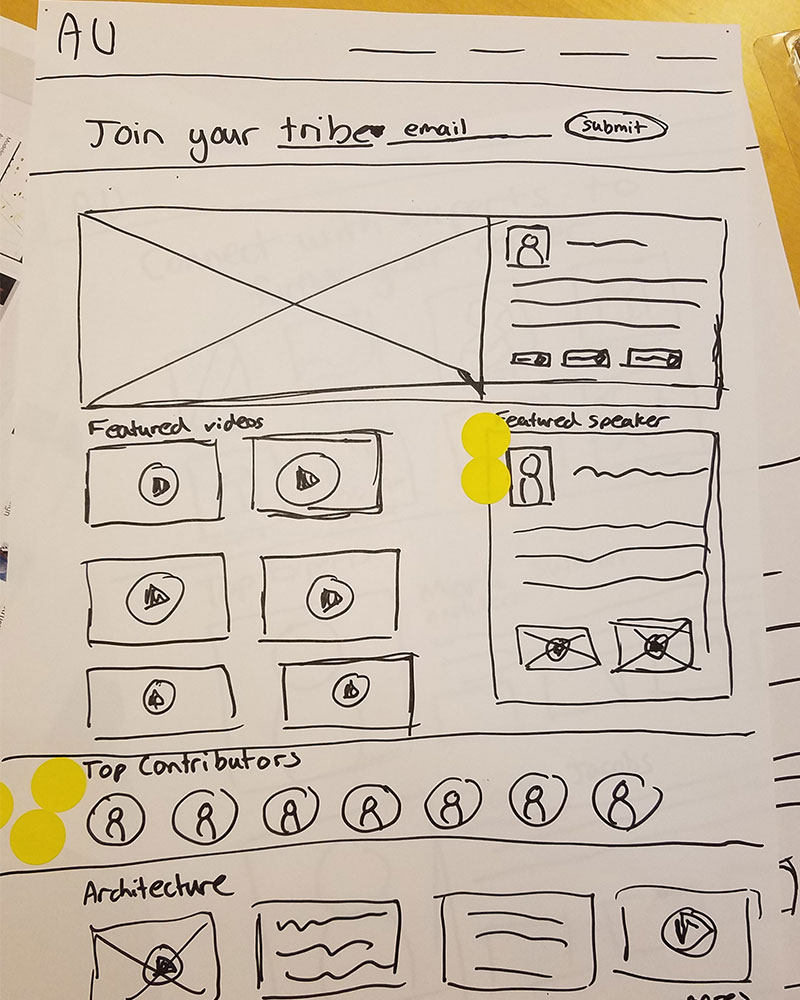


Homepage Designs & Prototyping
My team and I spent some time moving into higher fidelity based on our wires. Based on the designs we were coming back with, we decided to combine our directions into one final design for the prototype. I shifted my focus to navigation, a content page, InVision prototyping and what the testing would look like.


User Testing
User testing consisted of interviewing five users of the current AU website who also were very involved with the AU conference. Each interview was half an hour in length with my CD acting as moderator while we took notes and organized the information from a separate room.
Test Success Level
- 4 out of 5 were excited about the new AU website
- 4 out of 5 understood that the new AU website was a place to learn
- 2 out of 5 would sign up for the newsletter
- 5 out of 5 would use the new AU website to learn new practices
- 1 out of 5 understood that the AU identity was different from AKN
Based on the user feedback, we learned that users were excited for a new AU website, but teaching them about what AU had to offer would be a challenge. They seemed less focused on the online community aspect and seemed unsure if they'd participate. To really see if we'd be successful in the redesign, we needed to test more than just a homepage.

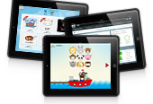
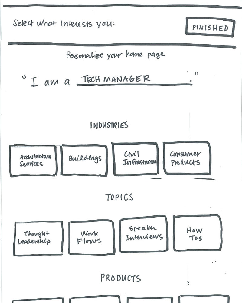
Sprint 2: Personalization & Sitemap
Sketching & Initial Exploration
"We believe that a personalized AU online experience will product content recommendations that are desireable to the user, reduce the time/steps a user needs to take in order to find 'relevant content' and result in increased consumption and return-visits. We will know this to be true when usability testing shows reduced friction and high acceptance of the proposed prototype solution."
Based on what we heard from sprint 1 testing, users seemed more interested in being served content specifically relevant to them and less interested in taking the time to find content. We knew from previous research and interviews that Autodesk users can be highly specialized in their field, so a majority of content is not interesting. We also needed to statisfy client requests around seeing a low fidelity version of much of the site, so they could visually see many of the pieces.
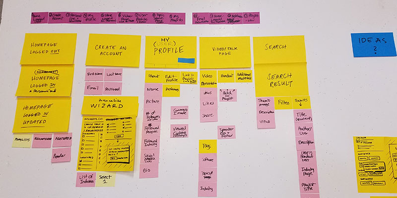


Designs & Prototyping
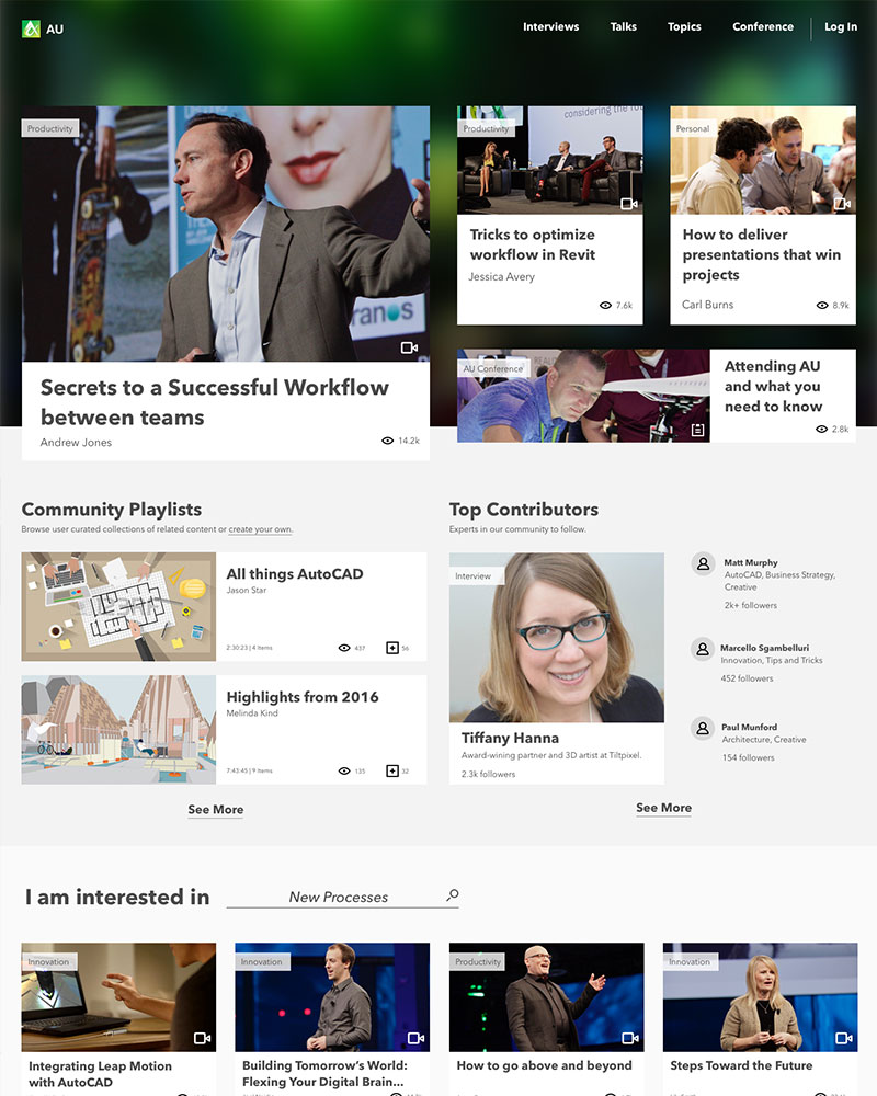
My Art Director and I moved into High Fidelity and Low Fidelity comps of most of the AU website. We tried to account for most of the pages that would exist. She focused on the Homepage and Personalization designs, while I advised on the UX of those pages, built out low fidlity wires for everything else and did most of the prototyping in InVision.

User Testing
User testing consisted of interviewing five users of the current AU website who also were very involved with the AU conference. Each interview was half an hour in length with my CD acting as moderator, while we took notes and organized the information from a seperate room.
What we learned:
- We had two types of users. Those that wanted to dive into the content right away and start exploring the website and those that wanted to immediately personalize their experience to only get served content relevant to them.
- Users did not want AU to try to replace Twitter and LinkedIn for networking.
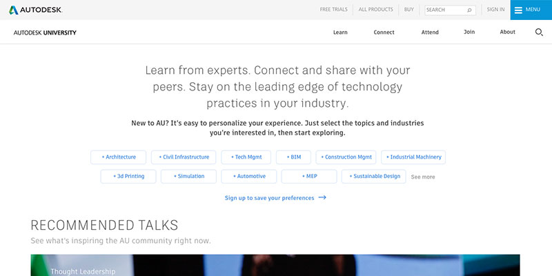
- Our 2nd iteration of the logged out homepage was much more successful in the first sprint homepage, because people could see their industry right away and know this was for them.
- AU Users wanted this website to be of value before and during the AU event.

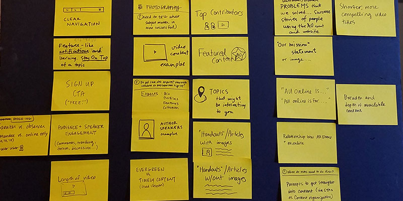
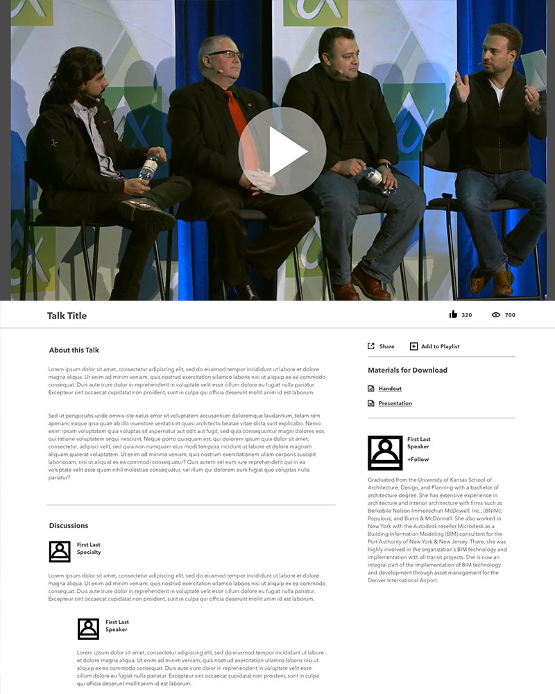
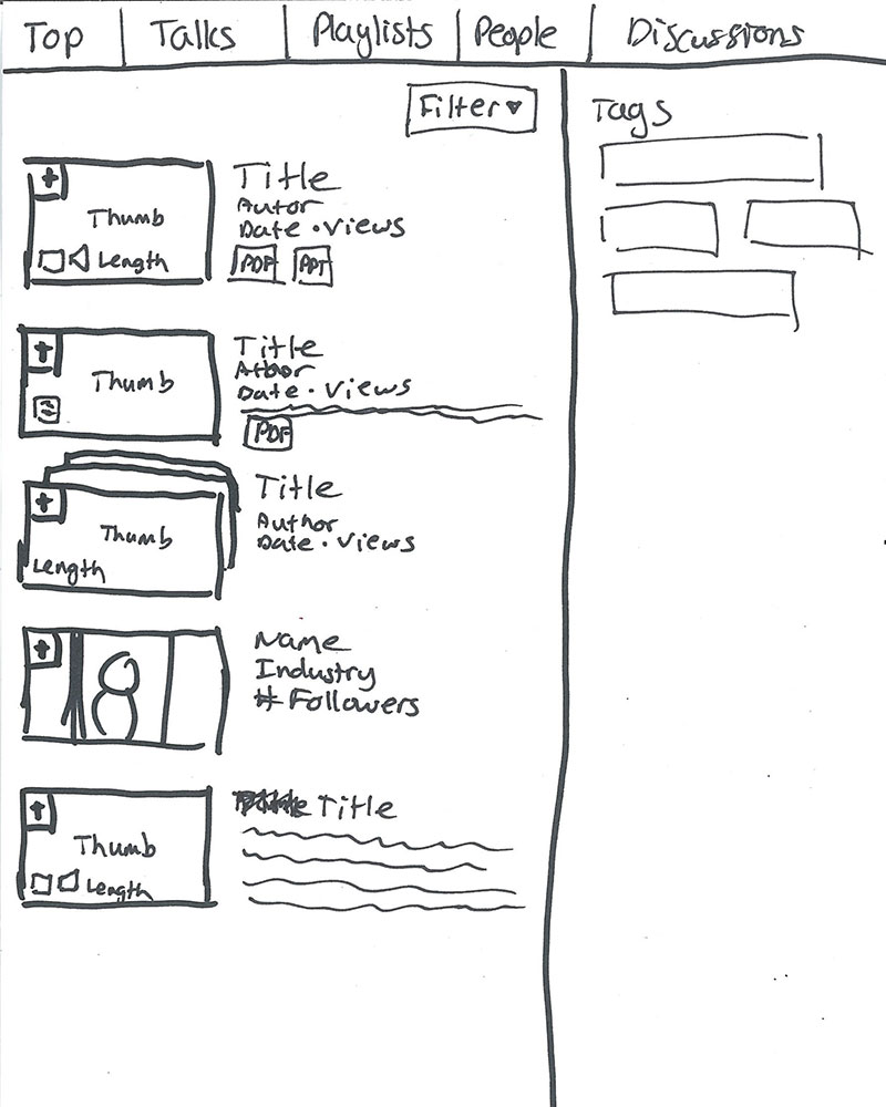
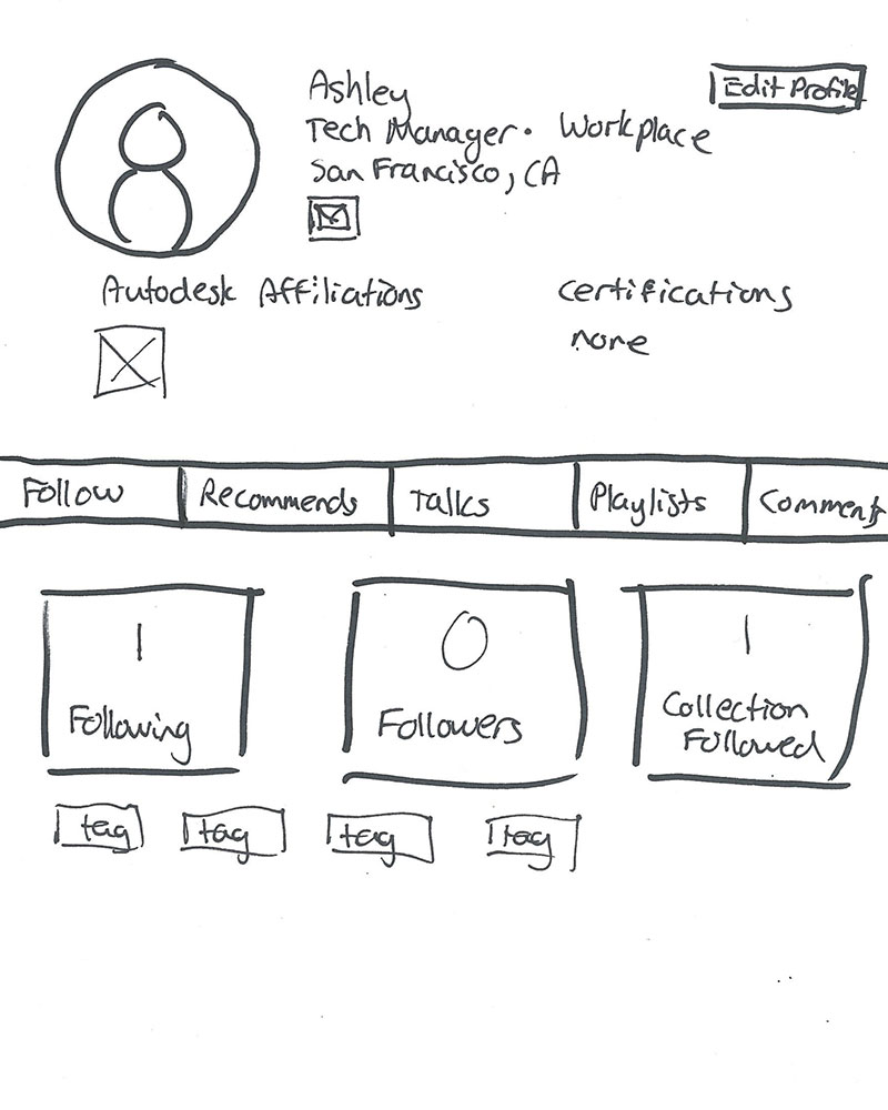
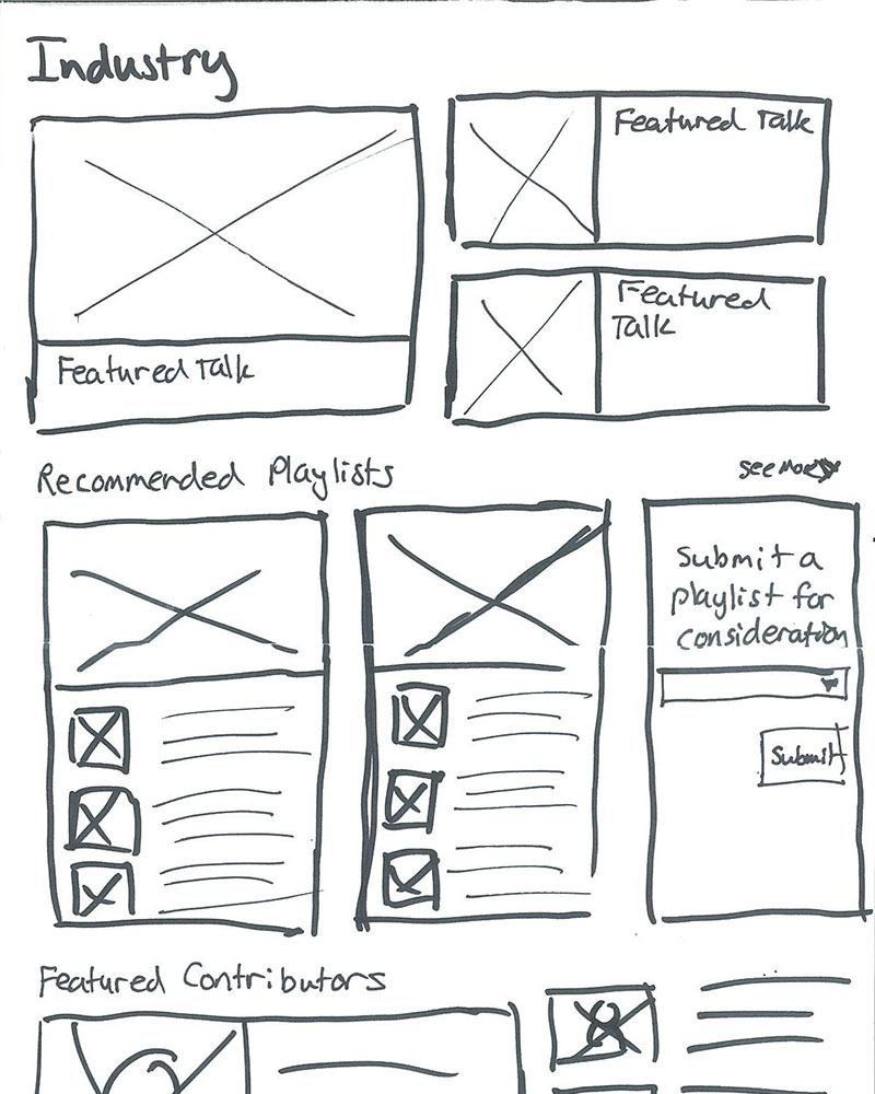
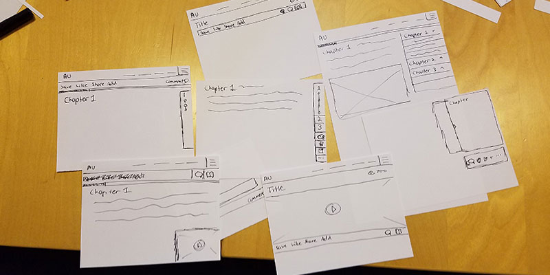
Sprint 3: Content Pages
Sketching & Initial Exploration
How might we improve the content experience so that it aligns with current and potentially new reasons our users come to the site?
Sprint 3 started off slightly different from Sprint 1 & 2. At the client's request, we began to design more for their vision and needs. Our test ended up being more of a usability test of the pages and less about if the content was needed, since we already knew the content was of high value to AU's users.

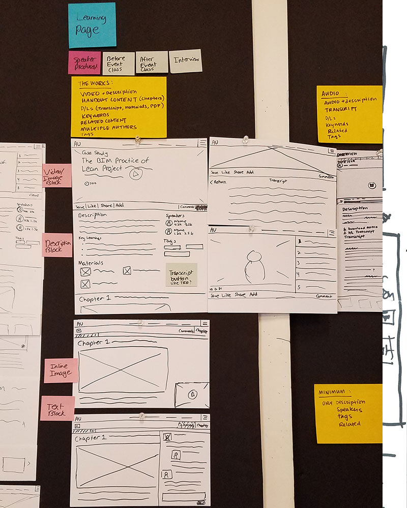


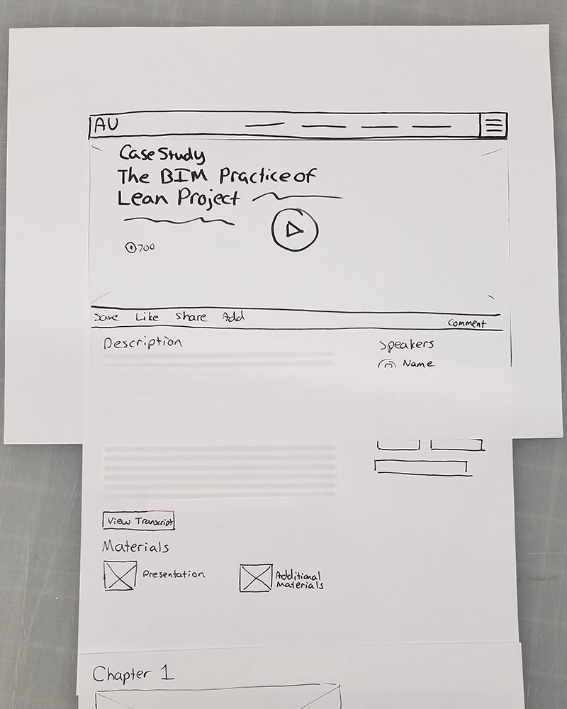

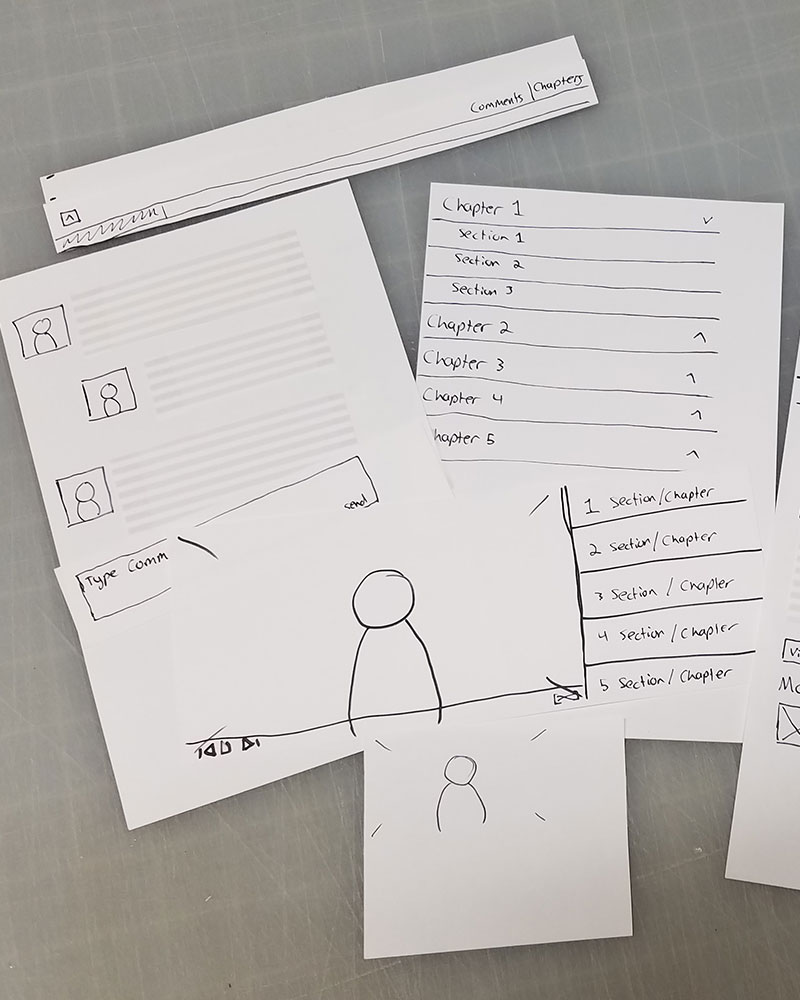
Designs & Prototyping
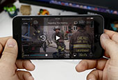
I did multiple sketches in the two days we had to concept these pages. There was a lot of functionality that we were trying to fit in that made the UX around the pages very challenging. We had very extreme usecases ranging from very little content to a video with a 70 page handout. How best should we display that information so that it is searchable and readable? How do we fit all these features on a page and still have them be elegantly designed?

User Testing
User testing consisted of interviewing five users of the current AU website who also were very involved with the AU conference. Each interview was half an hour in length with my CD acting as moderator while we took notes and organized the information from a seperate room.
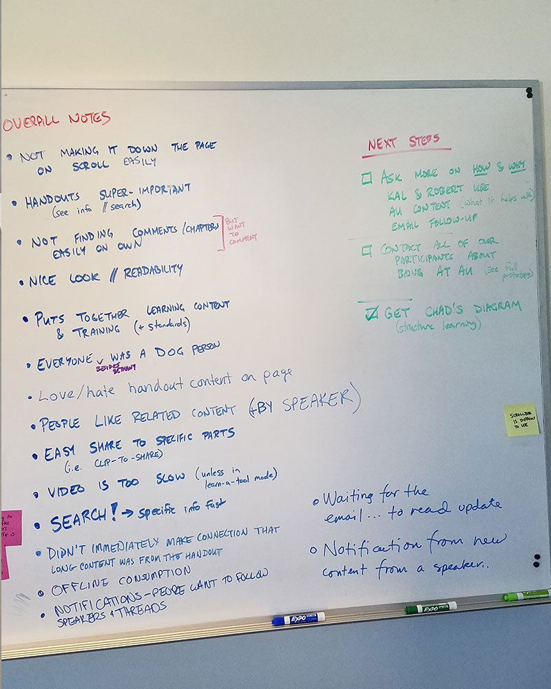
What we learned:
- Readability was successful though some users expressed dislike of the length of some of the longer pages.
- More visual cues were needed for the handout being embedded in the page.
- Search and more clear cues on how to search were needed.
- Overall people thought the design was an improvement on the current AU website.
In addition to the user learnings, we fulfilled client needs of seeing how a new page design could be flexible to hold many different types and lengths of content while still maintaining similar visual cues for the user.


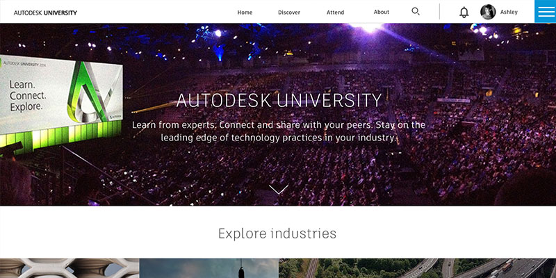
Final Prototype
Designs & Prototyping
The final build consisted of 4 weeks of taking the feedback collected during sprints 1-3 and updating the designs accordingly. My job was to incorporate that feedback from a UX perspective and to build the prototype that would go to AU 2016.